#POWERBI REPORTS LANDING PAGE TIPS AND TRICKS: Progressive disclosure design approach in Power BI us
- Prathy Kamasani
- Apr 30, 2020
- 2 min read
What is Progressive Disclosure? Progressive disclosure is an interaction design pattern that sequences information and actions across several screens (e.g., a step-by-step signup flow). The purpose is to lower the chances that users will feel overwhelmed by what they encounter. By disclosing information progressively, interaction designers reveal only the essentials, and help users manage the complexity of feature-rich websites or applications. https://www.interaction-design.org/literature/topics/progressive-disclosure
When we hear UX terms like Progressive Disclosure, it feels like they are essential for Web design or App design. Well, they are vital for report and dashboard design, especially landing pages. In this post, let’s look at the Horizontal card pattern.
Using Horizontal Cards:
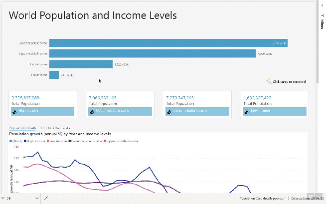
In the above example, I used a pattern to show details using action from the Card. When a user clicks on a card, the report will show details related to Card. It sounds straightforward, but it involves a lot of work using Power BI Functionalities: Buttons, Bookmarks, Sections, Grouping and Page Size.
There are few aesthetics I paid attention in this Report Page which are key for any landing page. Usually, a Landing page helps users to navigate around the Power BI Model, so it is important to highlight those navigation steps. In the above model, I used Buttons, labels and Images for navigation hints.
Button:
I again used the Button Hover effect as I used in the previous post. Instead of using images, I used a very subtle hover over shadow kind of effect. To achieve this, I added an Outline to the Button with the following properties.
Under Button, I added a shape with below properties.

My shape size is slightly less than the button size. So when the user looks at it, Shape looks like a card; overplayed Button gives an action to show detail and also hover over effect to provide User Experience users.
Labels:
I added a text label with an image to hint users to click on cards.

Images:
I added images to navigate back to the landing page. Also, to help users to highlight which detail window belongs to which category.

Bars:
I also added lines under buttons to show which tab has been selected using shapes in Power BI.

That’s all; I hope this inspires you to create some Power BI Awesomeness.
You can view Power BI report here – Link
Prathy 😊
Comments